

This was the first project that I worked on for The Calmness Centre. A Small business located in Barrie, Ontario, specializing in yoga, meditation & HypnoBirthing classes. In the initial client meeting the owner wanted the logo to symbolize ripples in water. The logo need to have a calming feeling.

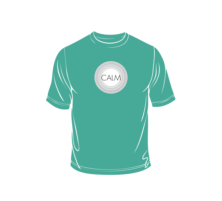
For the logo I got inspired to create a graphical representation of water ripples which was the base for this logo. Soft grey tones were then used to create the feeling of the ripples within the 3 circles that make up the logo. The business card itself actually got developed after the website. I used the website for inspiration for the look of the business card. This was so there was a direct correlation between the card and the website.

This design was particularly successful in terms of colour. Blue is a very "calming" colour, and green says "fresh". By picking the aqua colour which is in between green and blue I feel the it helped generate that calming feeling, but still speaking new and fresh.


So Creative!
Mathew is a very talented man. His passion for design really inspires me when we work together on a new piece of collateral. I trust in his expertise to bring to life a great final piece of work.


