
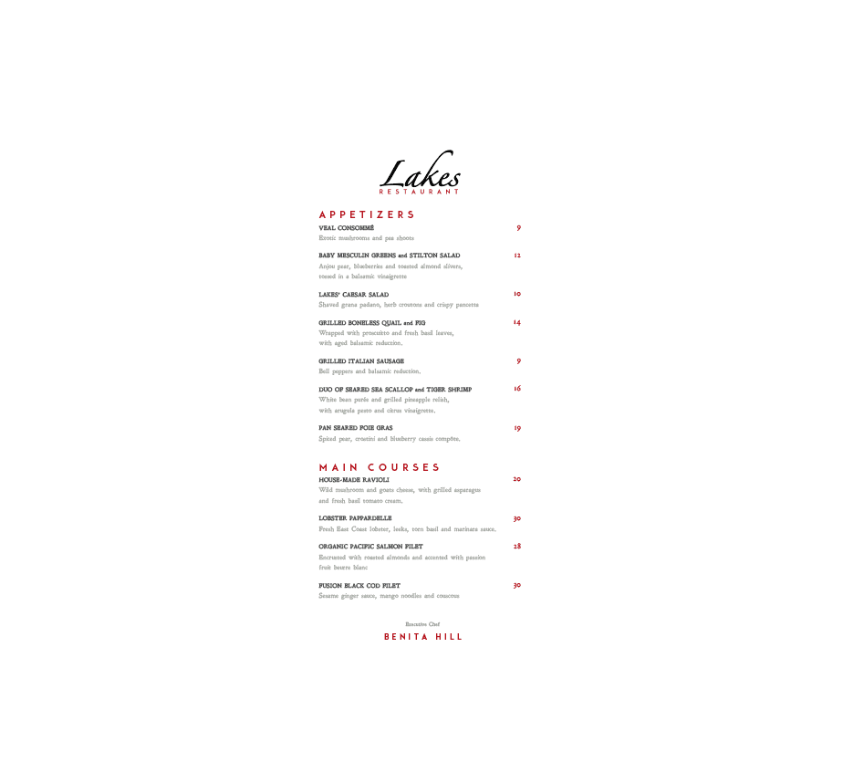
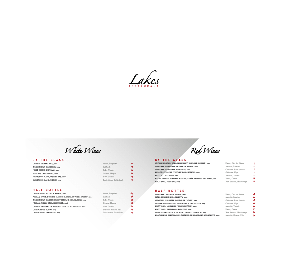

This project was for a small restaurant in Rosedale, Ontario about 7 years ago. They requested my graphic design skill set for a new logo, business card, menu & wine list. It was important that all four pieces looked cohesive. The challenged that they gave me was to find a font that didn't veer too far from what they already had. As it was fine dining they wanted something classic, but modern.

I wanted the design to have an editorial feel which is why I chose to go really vertical for the menu, and also the same reason I chose to make the wine list landscape. Both were not standard sizes. Lots of white space helps the layout breath and gives it a very classic feel. The typography I chose was a mix of modern, and vintage. I felt this really played off the classic, and modern look they were trying to achieve.

Overall the final product turned out really polished. I love the way the layout breaths, and the classic colour combination of red, white & black. My favorite piece of the bunch is the wine list.


Talented Young Man
Mathew is a very talented young man. We found him through word of mouth and he certainly delivered a polished menu and wine list.


