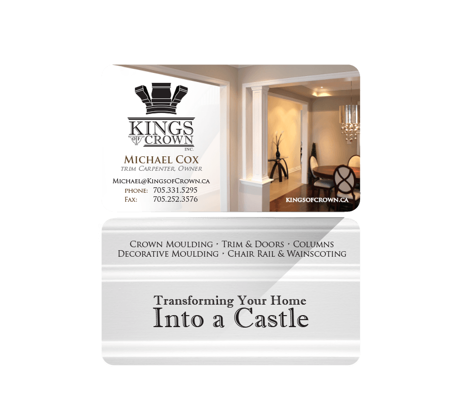

The project owner is a small company located in Barrie, Ontario, serving the surrounding area, including the GTA. The company specializes in trim carpentry. When developing the logo we initially thought a word mark, rather then an icon. After some time the client realized that he in fact wanted an icon to be apart of his logo. The business card was a natural progression from the logo development.

The inspiration for the logo was clearly the trim that the company uses on a daily basis. Taking those silhouettes and angles I transfered them into a word mark. Later the icon was actually developed by another designer. Ultimately being combined into the logo you see today.

The logo and business card really captured what Kings of Crown Inc. is all about. Therefor it's a very successful creative solution to me. The typography used for the box copy has an engravers type feel to it, which helped anchor it with the angles of the trim itself.


Great Creative Professional
You really nailed it on the head with the logo and business card that you did for me. You really understood what I wanted when I asked for professional, and polished.


