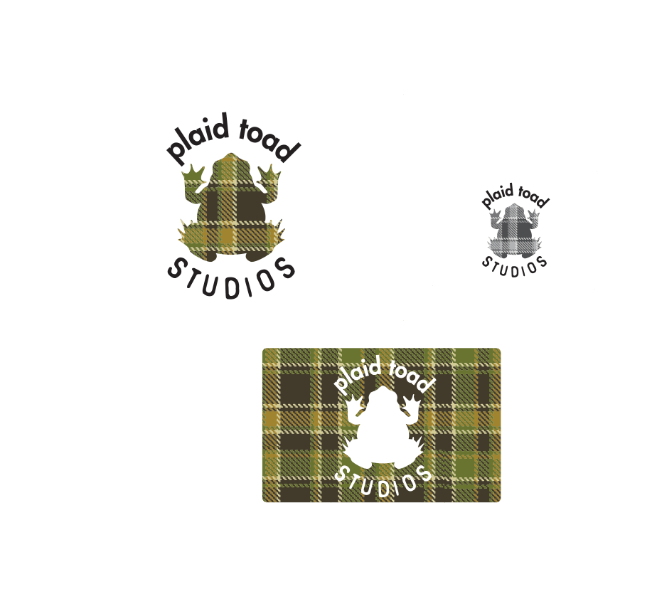
These were 2 different projects from a client that was just starting up 2 businesses in the Southern Ontario area. The first logo was for a shoe company, and the second for a promotional/branding company. The client wanted both logos to use the same fonts so that you knew they came from the same place. The first concept he asked for was to create an illustration that looked like him for the logo. The second concept was the toad.

There isn't a lot I can say about these logos in terms of rationale because what he was looking for was so specific. The illustration was taken from a photograph of his glasses which really reinforced his brand.

The logos turned out really well in terms of their cohesiveness. Using the same fonts really brought both brands together.


Superb service!
Mathew and I go way back. When we were working together I was very impressed with his level of professionalism. Great results!


